
There Is No Alternative But Inflation: Why Asset Ownership Is the Only Rational Response to Monetary Debasement
BLUF (Bottom Line Up Front): There is no alternative but inflation. The U.S. money supply (M2) has grown at a structural ~6% compound annual rate since 1981, more than double the 2-3% CPI figure most people plan around, and no serious effort to slow it, not even a 2025 government-efficiency initiative aimed straight at it, has ever bent the curve. Holding cash guarantees erosion at that rate. The only rational response is owning assets that climb at least as fast, filtered through three criteria, financialization, inflation-sensitive yield, and secular supply/demand imbalance, rather than the vague advice to “just buy assets.”
If you accept that the money supply is going to keep growing faster than your paycheck, the only rational move is to own things that grow with it, and to be specific about which things, because “buy assets” is useless advice on its own.
Picture a down escalator. Standing still on it doesn’t leave you where you started, it carries you backward at a fixed, unrelenting rate, whether or not you ever notice the motion. Most people treat holding cash as standing still.
It isn’t. It’s standing still on a moving staircase that’s descending the whole time, at a rate nobody prints on the sticker. The only way to actually gain ground is to walk up faster than the stairs are coming down.
I’ve watched this play out three separate times in my own life, in three completely different registers. A coin trade in my twenties that took over a decade to prove itself out, priced against a quote I still have a copy of.
A stretch where I nearly wrecked my own finances trying to force a strategy that didn’t fit who I am, the same mess that eventually led to Tax Sherpa existing at all. And a two-week window in 2025 where I watched an actual, serious attempt to fix the problem I’m about to describe, and genuinely doubted myself watching it happen.
None of those stories prove the thesis on their own, that’s what the rest of this piece is for, but they’re why I’m not writing this as theory.
Part 1: The 6% Nobody Budgets For
I pulled the FRED M2 series myself rather than trust a number I’d seen floating around secondhand. M2 is just the broadest widely-tracked measure of the money actually circulating in the economy, cash, checking and savings accounts, money market funds, the works. FRED’s continuous M2 data starts in January 1981, which, conveniently, is almost exactly when I was born.
M2 stood at $1,620.7 billion on January 5, 1981. As of August 25, 2026, it’s $23,207.7 billion. Run the compound annual growth rate on those two points across the entire span of my own life so far, and you get 6.0%.
 M2 (WM2NS), Board of Governors of the Federal Reserve System via FRED. The line most people never actually look at.
Not the CPI number the Fed talks about on television, the actual growth rate of the money supply itself, compounded across every recession, boom, war, and political administration that has occupied my lifetime, every one of which swore they’d be the disciplined ones.
And the CPI number itself is the inflation measure every administration has an incentive to downplay, so it keeps getting redefined in ways that conveniently trend the headline lower.
Plain CPI wasn’t flattering enough, so the basket of goods got revised. That wasn’t flattering enough, so we got Core CPI, stripping out food and energy, the two categories people actually notice rising. That wasn’t flattering enough, so we got Chained Core CPI, which assumes you’ll substitute your way around price increases (can’t afford steak anymore? the model assumes you’re fine eating more chicken) and quietly lowers the number again.
Each new measurement isn’t a refinement toward accuracy, it’s another layer of abstraction away from the plain fact that the purchasing power of the dollar in your pocket is shrinking.
Most people anchor their mental model of inflation to the 2-3% CPI figure because that’s what the talking heads repeat over and over again, and then wonder why their savings account never seems to keep up with reality. Part of the gap is legitimate, substitution effects, hedonic adjustments, and genuine technological deflation (a TV really is better and cheaper than it was twenty years ago) all pull the reported number down.
But the BLS methodology behind those adjustments is, at best, generous to the government’s own incentive to report a lower number. You are not paying 2.5% a year in currency debasement. You are paying something closer to 6%, and the difference between those two numbers, compounded over a working lifetime, my working lifetime, is the entire ballgame.
If you want to argue the 6% figure overstates things because some of that growth is just population increase, I’ll take the trade: divide M2 by U.S. population (FRED series WM2NS ÷ POPTOTUSA647NWDB) and you get 5.1% per capita, not 6.0%. Fine, call it 5%. The argument doesn’t need the sixth point. It needs the gap between whatever that number is and the 2-3% CPI figure everyone actually plans around, and that gap survives every adjustment anyone’s ever proposed to me.
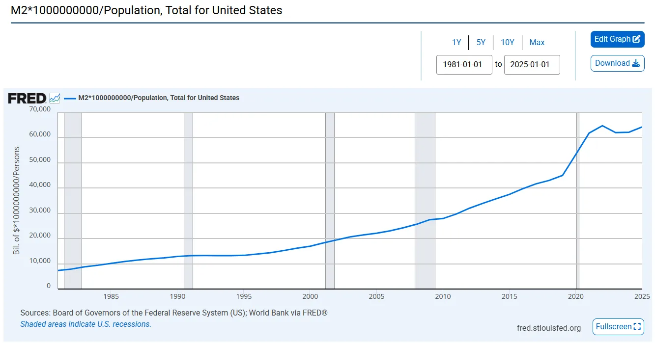 M2 ÷ U.S. population (WM2NS ÷ POPTOTUSA647NWDB). Strip out population growth entirely and the curve barely bends.
Whichever number you use, 6%, 5%, whatever the next revision lands on, call it the debasement floor: the speed of the escalator. Every dollar you hold as cash is standing on it. Your job is to hold assets that climb at least that fast, 6% a year, compounded, before inflation even gets discussed at the dinner table, or you’re not gaining ground, you’re just falling more slowly than the person standing still next to you.
The Cantillon Effect
Here’s the part that matters more than the headline number: that debasement doesn’t hit everyone at the same time or in the same order. This is the Cantillon effect, and it’s not a new idea, Richard Cantillon described it three hundred years ago, but almost nobody applies it correctly to their own financial planning.
New money doesn’t appear uniformly across the economy like rain. It enters through specific doors: government spending, bank lending, asset markets. Whoever stands closest to those doors, asset owners, institutions, borrowers with access to cheap credit, gets to spend the new money before prices have adjusted. Wage earners get the money last, after the person ahead of them in line has already bid up the price of the house, the stock, the input costs that eventually show up in the wage earner’s own grocery bill.
COVID as a Real-Time Demonstration
COVID gave us a rare, compressed-timescale demonstration of the underlying mechanism, even though it broke the usual queue order. Stimulus checks went out broadly and almost simultaneously, this wasn’t new money trickling down slowly from asset owners to wage earners over years, it landed in ordinary people’s bank accounts directly and fast.
And we watched, in real time, the prices of everything actually in demand, used cars, home appliances, lumber, furniture, go up immediately in nominal terms. You didn’t need seven decades of M2 data to see the mechanism that time. You could watch it happen over a matter of months: freshly created money chasing a limited real-world supply of goods, repricing everything almost as fast as it was distributed.
This is why “just work harder” fails as a wealth strategy for almost everyone. You are trying to out-earn a queue you’re standing at the back of.
The Fed’s Own Guaranteed Floor
And it’s worth naming exactly who stood at the front of that queue, by statute. Since the Federal Reserve Act of 1913, every member bank has been required to hold stock in its regional Reserve Bank, and for over a century, that stock paid a flat 6% annual dividend, guaranteed by law, to every member bank that held it, small community banks and the largest institutions in the country alike.
The statute’s own words, straight off the Fed’s website: “the stockholders shall be entitled to receive an annual dividend of six per centum on the paid-in capital stock, which dividend shall be cumulative.” Not on the bank’s whole balance sheet, on that one slice of required capital.
But for the better part of a century, the class of institution sitting closest to the money-creation spigot had a congressionally guaranteed 6% floor under a piece of its own balance sheet.
I don’t think that’s a coincidence, and I’ll state the causal direction plainly rather than dress it up as more than it is: member banks lend fractionally against a monetary base that keeps growing, and a bank holding a statutorily guaranteed 6% return on its safest capital has every incentive to anchor the growth of the rest of its balance sheet around that same number, not proof that the dividend rate mechanically transmits dollar-for-dollar into M2, just the shape of why the two numbers rhyme.
Everyone standing behind them gets whatever’s left after the queue has already repriced everything.
Wealth denominated in a debasing currency isn’t wealth.
It’s a claim, and claims can be diluted to zero. A 6% structural debasement rate is a slow-motion version of that same problem, and slow-motion problems are the ones people are worst at taking seriously until it’s too late to do anything cheap about it.
Part 2: Not All Assets Are Created Equal
A 6% long-run debasement rate means any amount of money you save is guaranteed to erode at roughly that rate, with short-term stretches well above it. That’s not just a get-rich problem, it’s a retirement problem, and retirement is exactly the wrong place to discover it, because retirement is a duration-matching problem, not a savings problem.
I’ve written before about investing like an insurance company, matching the duration of your assets to the duration of your liabilities. Retirement might come early or it might come late, but once you’re in it, you’re carrying a genuinely long-duration liability: your asset mix has to last the rest of your life, and hopefully then some.
Money sitting in a bank account doesn’t match that. It’s short-duration and almost certain to erode, a duration mismatch dressed up as safety. While you’re still working, you have the wherewithal to adjust course as debasement does its work. Once you retire, that flexibility mostly disappears, which is exactly when your asset mix needs to already be right.
So what actually matches a long-duration liability against a 6% debasing currency? Assets that preserve, and ideally grow, their inflation-adjusted value, through some combination of capital appreciation and cash flow.
“Buy assets” is not a strategy. Real estate, equities, gold, crypto, farmland, art, classic cars, these are wildly different bets with different mechanisms, and most of the popular advice about inflation hedging treats them as interchangeable. They aren’t.
Over the years I’ve settled on three criteria I actually use to evaluate whether something will track or beat debasement, rather than just feel like it should:
Financialization
Financialization is what happens when an asset stops being bought mostly with cash and starts being bought mostly with borrowed money, mortgages, margin loans, options, leveraged funds, structured products built on top of it. That matters because it changes what actually sets the price.
A couch is not a financialized asset: nobody takes out a 30-year loan to buy a couch, so the price of a couch tracks roughly what cash-paying households can afford, plus the cost to manufacture and ship it. A house is a financialized asset: almost nobody pays cash, so the price of a house is set by how much mortgage credit is available and how cheap it is, not by how much cash buyers actually have.
When the Fed and the banking system expand the money supply, most of that new money doesn’t show up as cash in people’s checking accounts, it shows up as credit: looser lending standards, lower rates, more leverage available to bid on the same fixed pool of assets.
An asset that people routinely borrow against gets bid up twice, once by underlying demand, and again by however much new credit is chasing it that year. An asset nobody borrows against only gets the first push. That’s the “second engine of price growth” this criterion is looking for, and it’s why financialized assets are structurally positioned closer to the front of the Cantillon queue described above, new credit reaches them first.
Inflation-Sensitive Yield
Every asset that produces income or usable value does so at some rate, and the question this criterion asks is whether that rate is fixed in dollar terms or free to move with prices.
A 30-year bond bought and held to maturity, paying a fixed 4% coupon, is the clearest example of the wrong answer: no matter what debasement does over those 30 years, you get exactly the same number of dollars back, and if those dollars buy less every year, your real return is quietly negative even though the account balance looks fine.
Compare that to a rental property: if rents in the local market rise because the cost of everything else is rising, your income rises with it, the yield is inflation-sensitive by construction. Commodity production (oil, grain, metals) works the same way, since the goods themselves are priced in the same debasing currency and reprice along with it. So does equity in a business with real pricing power, which can raise its prices when its costs rise.
One caveat worth being explicit about: “inflation-sensitive” describes a tendency, not a guarantee, and it doesn’t mean the price moves in a straight line.
Every good and every rental market has its own local supply and demand on top of whatever the monetary system is doing, a specific oil field can have a bad quarter, a specific rental market can soften because a factory closed down the road, a specific harvest can be unusually large. Those local factors will always be layered on top of the macro effect, and in any given year they can dominate it.
What you’re actually looking for isn’t a chart that only goes up, it’s a structural characteristic: does this category of asset, over time, tend to reprice along with the monetary system, the way a fixed bond coupon structurally cannot? Commodities and rents pass that test even though any individual commodity or any individual rental unit will have noisy, non-monotonic years along the way.
The distinction isn’t “does this pay income”, it’s whether that income is a fixed promise or a floating one that moves with the same tide that’s eroding your cash.
Secular Supply and Demand Imbalance
This is the criterion that separates a real structural bet from a short-term trade. Every asset has a supply-demand balance that moves with the business cycle, a recession year, a bumper harvest, a temporary glut. That’s noise, and it isn’t what this criterion is looking for.
What it’s looking for is a mismatch that holds over a long horizon regardless of where you are in that cycle: the supply is structurally constrained (a fixed mint run, a finite deposit, a regulatory or geographic limit on new production) while the demand side is on a multi-decade upward trajectory that isn’t tied to any single year’s economic conditions (a population getting wealthier, a generational shift in what people want to hold, a use case that keeps expanding).
An asset can pass the financialization and yield criteria and still fail here if its supply can simply expand to meet demand, more of it just gets produced, and the imbalance never has time to show up in the price. The ones worth holding are the ones where supply genuinely can’t catch up.
Part 3: The Filter Applied
Silver and the Panda Coins
I actually applied this filter, before I had it written down this cleanly, back in the late 2000s and early 2010s, when I started buying silver. Some of it was junk silver: pre-1965 U.S. coinage, bought purely as a blunt inflation hedge. That trade has borne out exactly as intended.
But I also bought Chinese silver Pandas, numismatic coins, not just bullion, and that was a more deliberate application of all three criteria at once. Why silver specifically? A structural supply-demand imbalance: industrial and investment demand outstripping mine supply over the medium term. Why numismatics on top of the metal? Because in an inflationary environment, people don’t just want a store of value, they preferentially want the combination of artwork and precious metal, which adds a demand premium bullion alone doesn’t carry.
Why Chinese numismatics specifically? Because the mint rates on those coins through the 1990s and 2000s were tiny relative to the size of a Chinese population that was rapidly developing its own investable wealth. That’s a secular demand curve steepening against a fixed, already-scarce supply, not a bet on next quarter’s silver price.
There’s a second layer to that supply story I got to watch happen in real time. When I started buying these coins, the market didn’t yet distinguish between varieties within the same year and denomination, a 1995 Panda was just a 1995 Panda. Some of the people I was working with in that space discovered that coins from different mints, or with subtle die differences, weren’t actually identical: some varieties were dramatically scarcer than others.
Once that distinction got recognized and the grading services started certifying it, the market split what had been one price into several, and the genuinely scarce varieties repriced hard relative to the common ones. That’s the secular supply-demand imbalance criterion showing up twice in the same asset, once at the level of silver as a metal, and again at the level of a specific variety within a specific coin, once the market actually had the information to see how scarce it was.
The receipts: On March 15, 2012, a buyer I was working with in China sent me a price list quoting both versions of the 1995 Panda, same coin, same year, same condition, just two different design varieties, at the exact same price: 640 RMB each, $101.14 at that day’s actual exchange rate of 6.3282 RMB/USD. One identical price for both, the market hadn’t yet priced in the scarcity difference.
I checked current eBay sold listings for the same coin: the common version sold for $250 on September 2, 2026. The rare version sold for $490 on September 5, 2026, 55 bids deep in a live auction. Run the CAGR on each from that 2012 quote to today’s sold price: the common version comes in at 6.7%, matching the escalator’s speed almost exactly, it broke even against debasement and nothing more. The rare version comes in at 11.9%, nearly double the escalator’s speed, which is what actually climbing looks like, not just avoiding the fall.
 The actual 2012 quote. Both varieties, same price, 640 RMB, the market hadn’t split them apart yet.
 Sold listings, fourteen years later. Same coin, same year, same grade, a 2x gap once the market caught up to the scarcity.
Same starting price, fourteen years, and the only thing that changed was the market’s information about which one was actually scarcer. That’s the secular supply-demand imbalance criterion showing up in real, checkable numbers instead of an estimate: identical assets a decade ago, a 2x price gap today, purely because supply-side information caught up to what was already true.
Get the mismatch right and merely tracking debasement is the floor, not the ceiling, the rare version is the pattern this whole framework predicts, the common one is the reminder that the filter has to be applied correctly, not just applied.
The Same Filter, Applied to Bitcoin
I’ve applied the same filter, with a very different asset, to Bitcoin. Everything else in this piece is checkable against a paper trail: FRED data, a CBO report, a coin receipt with a timestamp on it. Bitcoin is different. This is an area where I’m actively speculating with fresh money, not reporting a settled conclusion.
I’ve been dollar-cost-averaging into it for years, treating it the way a corporate treasury would treat a reserve asset rather than a trade. Why Bitcoin? Because it’s the actual escape hatch from a monetary system that is structurally committed to debasement. I’m not making a claim about cryptocurrency broadly, thousands of chains have launched, and most of them are trying to do something other than function as money.
My claim is narrower: Bitcoin currently occupies the store-of-monetary-value function, period, and from here, the way I see it, there are only two paths for whichever asset holds that specific position: it continues growing in nominal terms as more of the world routes around currency debasement through it, or demand for holding it eventually goes to zero and it dies. Right now, that asset is Bitcoin.
My Opinion: I believe Bitcoin has now survived the window in which a coordinated government crackdown could have killed it outright, and I think two pieces of evidence back that up.
First, in January 2024 the SEC approved eleven spot Bitcoin ETFs, after rejecting more than twenty similar applications over the prior decade, letting U.S. institutional capital buy direct Bitcoin exposure through the regulated financial system. BlackRock’s fund alone reached $20 billion in assets faster than any ETF in history. That’s the largest financial regulator in the world converting from gatekeeper to distribution channel.
Second, China has tried to kill Bitcoin outright multiple times, banning it as a payment method in 2013, banning fiat-to-crypto exchange in 2017, and then in May 2021 launching the most aggressive mining crackdown to date, one that cut the network’s global hashrate in half in weeks and briefly zeroed out China’s roughly 60-65% share of it.
The network didn’t die. The miners moved to the U.S., Kazakhstan, and Russia, and the hashrate recovered. The single government most willing and able to physically shut down mining operations within its own borders did so, repeatedly, over more than a decade, and the network outlived every attempt.
Neither of those facts proves Bitcoin survives forever, that part is still a bet. But I don’t think the “it goes to zero” path is where we are anymore. There will be brutal short-term booms and busts along the way, that’s a feature of the asset, not a refutation of the thesis, but the long-run trend is, in my view, close to inevitable. As I tell people who ask me why I hold it: there is no alternative but inflation.
The Fourth Filter: Grain
There’s a fourth filter underneath all three of these, and it doesn’t show up in the criteria table because it isn’t about the asset, it’s about you. Financialization, inflation-sensitive yield, and secular supply/demand imbalance tell you whether an asset is structurally positioned to survive debasement. They don’t tell you whether you’re the kind of person who can actually hold it.
I’ve written elsewhere about Grain, the idea that people have a fixed set of traits that determine which activities and strategies they can sustain and which ones will wear them down, no matter how sound the underlying logic is.
The three criteria tell you whether an asset climbs faster than the escalator descends. Your grain tells you how hard that climb actually feels to you, the same uphill walk that’s sustainable for one person’s temperament is exhausting or impossible for another’s, regardless of how correctly they picked the asset. An asset has to pass the three criteria and fit your grain, or you won’t hold it long enough for the first three to matter.
I learned this the expensive way, early in my adulthood, when I decided day trading was going to replace having a job. I didn’t want to work for anyone, and day trading looked like a way out, sit at a screen, read the charts, make money without a boss.
What I actually did was invent the worst job I’ve ever had: no salary, no benefits, and a temperament that was completely wrong for staring at charts and making dozens of high-pressure decisions a day. It wasn’t that the trades themselves were uniquely stupid, it was a fit problem. I was trying to run an activity that requires a specific kind of nervous system through a nervous system that doesn’t have it.
That period is also, directly, where my tax problems started, the mess I made trying to force a strategy that didn’t fit who I am is the same mess that eventually led to Tax Sherpa existing at all.
Bitcoin passes my grain test the way day trading never did. I dollar-cost-average into it on a schedule and mostly don’t look at the price in between, which is exactly the kind of low-frequency, low-decision-count behavior my temperament can actually sustain for years. That’s a separate claim from whether Bitcoin passes the three criteria above, it’s the reason I’m the one holding it, rather than someone else.
Part 4: What DOGE Actually Proved
DOGE, the Department of Government Efficiency, the Musk-led initiative that set out in 2025 to cut federal spending and headcount department by department, is the cleanest real-time test of that “no escape” claim I’ve seen, and I’ll admit it actually shook me at first.
For about two weeks after it launched, I had genuine doubt. Here was this unconventional effort, a mix of billionaires and, from the outside, what looked like a ragtag group of very young staffers going department by department, and I remember thinking, half-seriously, “what if this actually works? What if this is the thing that slows the escalator down?” I sat with that question for two weeks, actively second-guessing the whole thesis.
Then I watched how Congress actually handled the DOGE-identified cuts once they hit the floor. The proposed reductions got negotiated down, carved out, or quietly restored, department by department, regardless of which party controlled which chamber. And I realized I hadn’t been wrong, I’d just been watching the wrong stage of the experiment.
Here was an actual, serious, high-profile effort to cut government spending, not a think-tank paper, an operating attempt, with real contract cancellations and real headcount reductions on the ground. And even so, once that effort hit the actual legislative machinery, aggregate spending kept climbing: the Congressional Budget Office puts total federal outlays at $6.8 trillion in fiscal year 2024 and $7.0 trillion in fiscal year 2025, a $301 billion, 4% increase, in the same fiscal year DOGE was actively operating.
No dip.
The escalator didn’t slow down for the one serious attempt anyone’s made to slow it. The system is built the way it’s built, and there’s no escape hatch inside it. Inflation is the only answer it’s structurally capable of producing.
To be precise about the mechanism, because it matters: fiscal spending and monetary inflation are not the same thing. Cutting a government contract doesn’t mechanically shrink the money supply, and growing the deficit doesn’t mechanically expand M2 either, they run through different plumbing. But they’re links in the same causal chain.
The reason spending keeps rising regardless of who’s nominally in charge of cutting it is that the incentive structure of everyone inside the system rewards growth and punishes restraint, politically, bureaucratically, and electorally. That incentive structure is the actual constituency behind the debasement path.
It’s not a conspiracy and it doesn’t require bad faith from any individual actor; it just means the path of least resistance for the system as a whole runs toward more money creation, not less, regardless of which party or which efficiency initiative is nominally in control.
DOGE didn’t fail because the people running it weren’t serious. It failed to move the aggregate number because the aggregate number isn’t actually being decided by the people trying to cut it.
If the mechanism holds even when someone is actively trying to break it, that’s about as strong a confirmation as you’re going to get without a controlled experiment.
Part 5: The Objection, and What to Actually Do
The most common pushback I hear is some version of “sure, but asset prices are already high, isn’t this a bad time to buy?” I think this gets the causality backwards. An asset trading at a rich valuation because more debt and more derivative flow have been pouring into it isn’t a red flag under this framework, it’s the financialization criterion doing exactly what it’s supposed to do. “Overvalued,” in a lot of cases, is just what a financializing asset looks like from the outside, mid-process.
Housing is the cleanest example of what growing financialization actually does to a price, because you can watch the leverage change and put real numbers on it. 150 years ago, essentially nobody borrowed money to buy a house, you paid cash, or you didn’t buy.
Then the short-term balloon mortgage was invented: a loan where you paid interest for a few years and then owed the entire remaining balance in one lump sum, due on a fixed date, with no guarantee you could refinance it. Those are the loans behind every Dust Bowl and Great Depression story about a family losing the farm to the bank, the balloon came due at the exact moment banks stopped renewing loans, and families with no ability to pay off the full balance simply lost the property.
From there, the amortizing fixed-rate mortgage was developed, and two things kept expanding for the better part of a century: the duration of the loan (from short terms out to 15 years, then 30) and the loan-to-value ratio lenders would allow, helped along by government programs specifically designed to let buyers borrow a larger share of the purchase price.
When I was young, the standard deal was a 30-year mortgage at 80% loan-to-value: you needed 20% of the purchase price in cash to close. Various government-backed programs since then have pushed that down toward 5%, or even lower for qualifying buyers.
How it plays out in real numbers: Say a buyer has $80,000 in cash available for a down payment, a fixed pot of dollars, the same either way. At 80% LTV, that $80,000 is a 20% down payment, so it supports a $400,000 purchase. At 95% LTV, that same $80,000 is only a 5% down payment, which supports a $1,600,000 purchase.
The buyer didn’t get any richer. The pot of cash didn’t grow. But the size of the asset that pot of cash can control quadrupled, purely because the lending system now lets that same buyer put a smaller fraction down. And because every other buyer in the market has access to the same expanded leverage at the same time, that additional purchasing power doesn’t sit idle, it gets bid into the price of the fixed stock of houses everyone’s competing for.
That’s the mechanism, and it’s why “overvalued” is such a slippery word to apply to a financializing asset. Overvalued relative to what, relative to what the same asset would have cost at yesterday’s leverage terms? The measuring stick itself has been getting longer for a century.
When the amount of leverage available against an asset keeps expanding, you’re not comparing today’s price to some fixed, objective value, you’re comparing it to a moving target, which makes calling the long-run trend “overvalued” in any macro sense far harder than the pushback assumes.
None of this means every expensive asset is automatically a buy, it means valuation multiples alone are the wrong lens if you’re evaluating for debasement resistance rather than short-term mean reversion.
None of this is an argument for stuffing money under a mattress or trying to time entries. Timing the escalator is the wrong game, the stairs don’t pause for you to find the perfect step.
The three-criteria filter, financialization, inflation-sensitive yield, secular supply-demand imbalance, is what tells you which assets climb faster than it descends, not when to start walking.
I’ve applied it to precious metals and to Bitcoin; the same underlying logic is exactly why I’m building toward land and rotational livestock as a third leg (more on that in The Metabolic Cost of the Horizon), real assets with genuine, structural supply constraints and demand that only grows as more people wake up to the same math, which means they only climb faster from here, not slower.
If you’re structuring your own finances around this reality, the sequence matters. Get the entity and tax structure right first, how you hold appreciating assets determines how much of the upside you actually keep, which is the work we do at Tax Sherpa. Then put the capital into the actual hard asset. If land and productive livestock are the vehicle, that’s what Resilient Roots is built for.
The debasement isn’t a crisis narrative. It’s a structural constant, it’s run at roughly 6% a year for the entirety of my life, and it isn’t stopping because an efficiency initiative wants it to. The only move that has ever worked against it is owning the machine instead of holding a claim on it.
Sources
- FRED, M2 (WM2NS), Board of Governors of the Federal Reserve System via FRED, weekly, not seasonally adjusted. M2 = $1,620.7B (Jan 5, 1981) to $23,207.7B (Aug 3, 2026); CAGR calculated from these two points.
- FRED, Population, Total for United States (POPTOTUSA647NWDB), World Bank via FRED, annual estimates. Population = 229,466,000 (Jan 1, 1981) to 341,784,857 (Jan 1, 2025). Per-capita M2 (WM2NS ÷ population) = $7,063 to $63,404, a CAGR of 5.1%.
- FRED, China / U.S. Foreign Exchange Rate (DEXCHUS), Board of Governors of the Federal Reserve System via FRED. Rate on March 15, 2012 = 6.3282 RMB/USD; used to convert the 2012 Panda price quote.
- Federal Register: Federal Reserve Bank Capital Stock, background on Section 7(a)(1) dividend structure and the FAST Act’s 2016 amendment.
- Federal Reserve Board, Financial Accounting Manual, Appendix B, Dividends, current dividend mechanics for Reserve Bank stockholders.
- 12 U.S. Code § 289, Dividends and surplus funds of reserve banks, statutory text.
- CBO, Monthly Budget Review: Summary for Fiscal Year 2025, FY2024 ($6.8T) vs. FY2025 ($7.0T) total federal outlays.
- SEC Statement on the Approval of Spot Bitcoin Exchange-Traded Products, January 2024 approval of the first eleven spot Bitcoin ETFs.
- Coinbase, “A history of China’s crypto crackdowns”, timeline of China’s 2013, 2017, and 2021 crypto bans and the 2021 mining-ban hashrate impact.